Rocket Insights recently partnered with Virgin Pulse, the leader in enterprise health and fitness, to build a new Apple Watch app, and we are excited to announce the app has launched today in the Apple App Store.
We worked with the team at Virgin Pulse over the course of several months to design and build the app and learned a lot in the process. Below we share some of the challenges we faced and lessons we learned. Our experience over the last year has shown these challenges to be surprisingly common across companies who are considering what to design and build for the Apple Watch platform.
Building a Successful Enterprise Health & Fitness App - Where Do you Start?
Prior to taking on the Watch app project with Virgin Pulse, we had worked with the company to improve their iOS delivery process and helped increase their App Store rating to 4.5 stars. During this time we became familiar with the Pulse platform, a fully-featured health and fitness tracking app used in some of the largest companies in the world, such as GE and Coca Cola. Like many teams considering building an Apple Watch app as part of their mobile ecosystem, they had a big list of questions around what, exactly, to build. These included:
- Which features of the Virgin Pulse iPhone app should we build into the Watch app?
- What watch-specific features should we add?
- What features should we take away?
- What should the first version of the app look like?
- How do we make the Watch app valuable to users?
- What things should we avoid?
Porting the entire iPhone app to the Watch didn’t make sense, so we had to figure out a strategy on what to port over and what to keep on the iPhone. The Watch hardware was undeniably cool, but many of the initial Watch apps were less than compelling for several reasons, including relatively slow performance, unclear interaction patterns, and an overlap of features with a paired iPhone app. After much discussion, tons of mockups and lots of usability testing, we ended up building a simple, lightweight Apple Watch app that nicely complements the full-featured Virgin Pulse iPhone app while strategically leveraging the unique capabilities of the Watch. Here's how we did it.
Three Lessons Learned From Building a Notifications-based Apple Watch App
As we started down the path with the team at Virgin Pulse and began designing and developing the app, we learned a lot about what makes a Watch app successful. Here are three lessons that we learned:

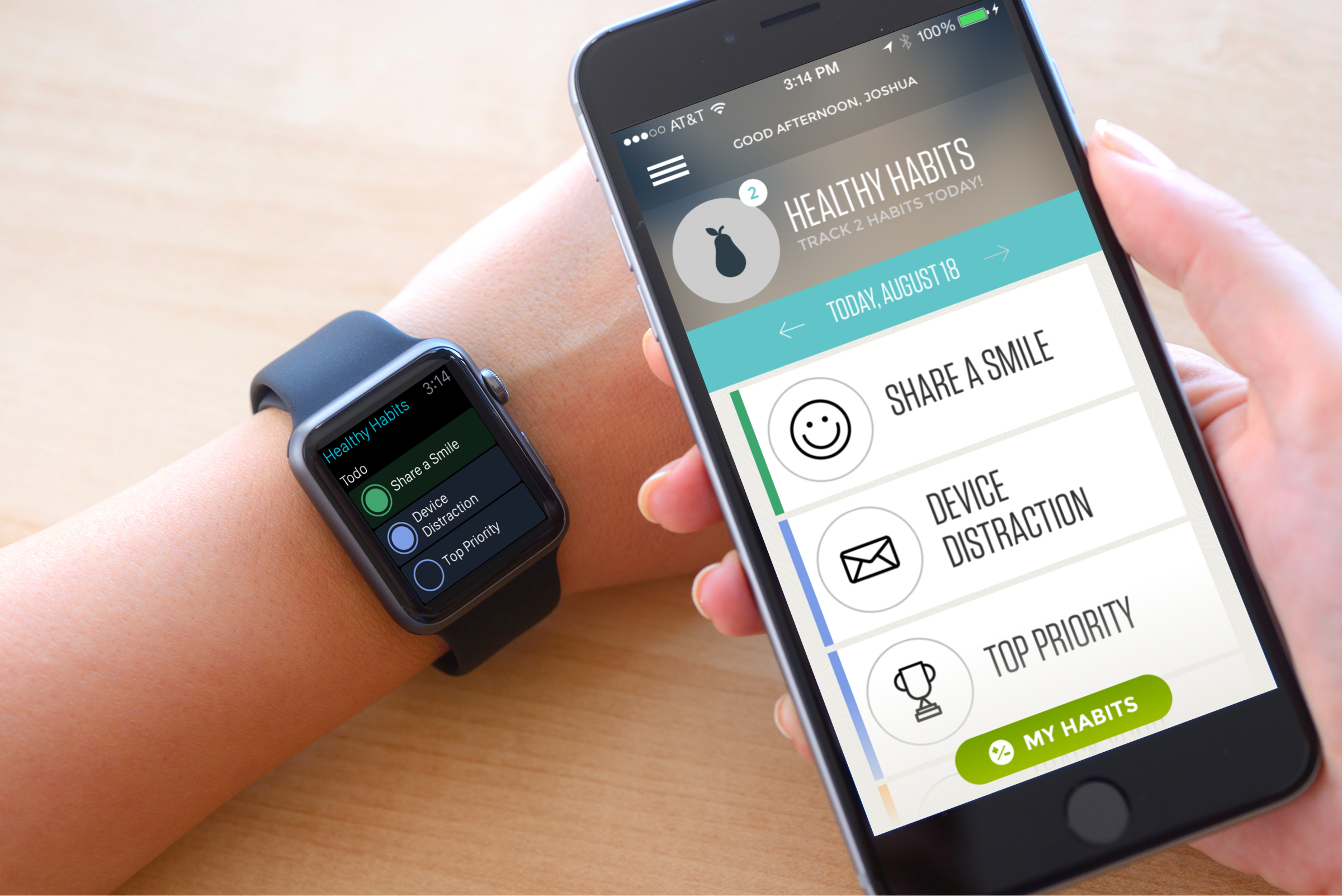
For Healthy Habits we brought over only a small portion of the larger iPhone feature set.
Lesson #1: Only replicate features that are better on the watch
Much has been made of the fact that Watch owners do not pull out their iPhone all day like they used do. Instead, they use the Watch to glance at text messages, find out the weather, check the time, etc. This seems to suggest that the Watch can be considered a solid replacement for a lot of the iPhone’s functionality.
So when we dug in and conceptualized the Virgin Pulse Watch app we first focused on replicating what we saw as the main features of the watch. We created a Watch version of each of the features on the iPhone. We built clickable mockups and tested them. What we learned surprised us. Most features were not useful as Watch features...in fact most were actually harder to use there. The small screen size completely changes the game: the larger screen of the iPhone makes most features easier to use because there is just so much more room to display content and actions.
We discovered that the only features worth replicating were those that were actually better on the Watch. Not just the same, but easier, faster, or more delightful. For example, one of the core features of the Pulse platform is the healthy habits list: the list of habits you are trying to improve each day. This was one of the few features we did bring over to the Watch because we could make them easier and faster to enter there. When you open the Watch app you can tap extremely quickly to complete those habits you've done that day. But we did not bring over the whole healthy habits feature set. We left much of the functionality around managing and learning about habits to the iPhone and Web experiences. Those experiences are much better on those platforms. In the end we only brought over the small fraction of the feature, a small fraction of our original

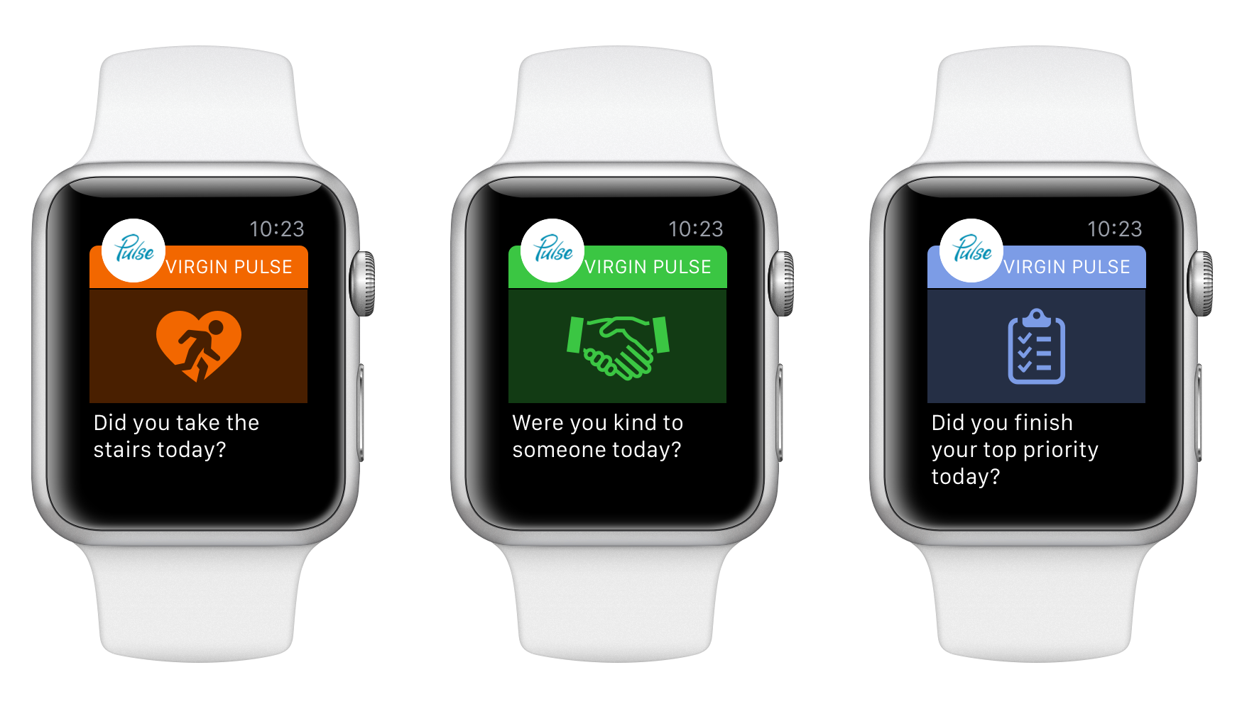
We designed a catchy but extremely simple notification system for the Pulse Watch app.
Lesson #2: Notifications Rule
So if the basic advice is to keep features in the iPhone app and not replicate them in the Watch, then what does your Watch app become? What should you build?
To help figure this out we talked to a lot of Watch owners about what was working well for them. When we asked them what apps they use and like on their Apple Watch the answer was invariably apps that delivered intelligent notifications. This was fascinating...that answer was consistent across the board. People are not using Watch apps as much as they are merely receiving quick notifications about their lives. So Watch software is, in a sense, a notification framework for your iPhone app. The Watch is merely the delivery device for it.
Further, when we talked to folks at Apple about the Watch, they said the same thing. Think of the Watch as something you interact with in single glances and taps and focus a lot of energy on making notifications valuable.
So as we built out the Virgin Pulse app we made sure to pay close attention to our notification strategy. As the saying goes, timing is everything, so we chunked notifications around certain times of day and made sure they were actionable. This was crucial to creating valuable notifications. Making notifications actionable was the number one variable in making them valuable. It doesn’t mean that users have to respond to a notification, but the information needed to be valuable enough that it might change the user’s behavior during the day. Notifications rule.

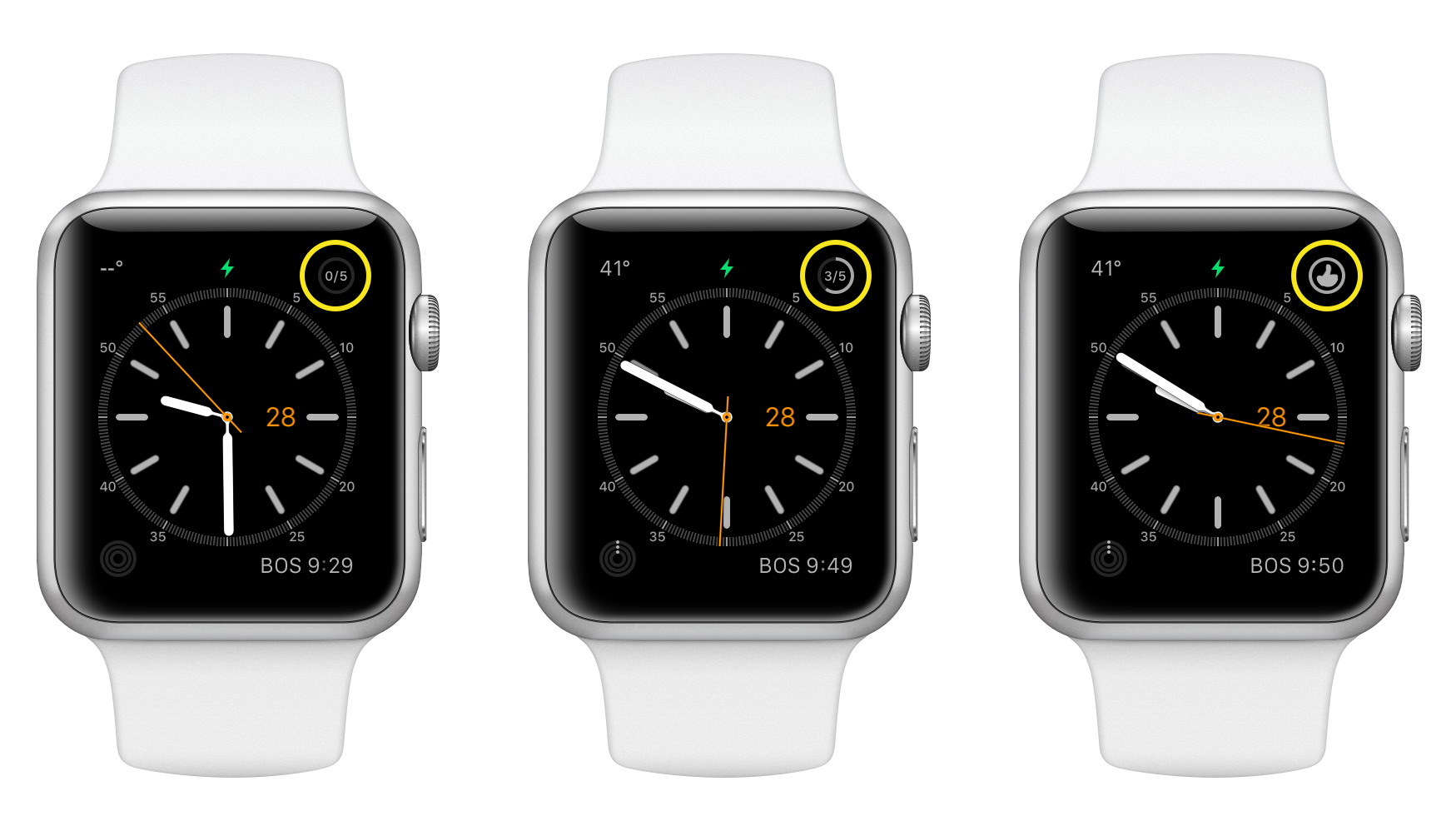
We designed the complications to show information that changes frequently.
Lesson #3: Emphasize the Strengths of each Watch UI Element
The Apple Watch platform has many different UI elements, each with its own strengths and weaknesses. It is not easy to anticipate exactly what information is best shown in each UI element without testing and iteration. We designed many different interfaces with different types of information for each of the elements and came away with a new appreciation for how to use each. Here is a general framework that worked for most situations:
- Complications (frequent changes): Complications, named after the hardware counterparts found on high-end watches, are elements of the Watch face itself and so are potentially seen every time a user looks at their Watch. Because of this frequency it makes sense that these should contain information that changes a lot during the day. We designed the complications Virgin Pulse Watch app to feature the progress that someone was making toward their habits during the day. (see above screenshot) Progress toward these habits changes a lot but at any given moment a user can quickly check in to see their progress.
- Glances (changes a few times per day): The glance is a subscreen that users look at several times per day. Glances are read-only screens that, when tapped, take users into the Watch app itself. Information on these screens is seen a few times per day so it makes sense to show information that changes about that much. For the Pulse Watch app we chose to show the leaderboard standings which do fluctuate as the day progresses but not as much as daily habits information.
- Notifications (real-time updates): Notifications are screens that the Watch displays after notifying the user with a wrist vibration. The information displayed in notifications should be extremely relevant or actionable because you are distracting folks with a real-time update. It is critical that information displayed as an interruption be highly relevant. We chose to display important habit information in notifications.
- App With all the above UI elements the Watch app itself is actually the last thing a user interacts with! So when we did design out the app screens, we put longer-term and slower-changing information there. In practice this worked out well because it forced us to really prioritize information in a user-centric way.
It is ironic that for such a small screen there are many different UI elements to consider when building a Watch app. After iterating and testing we came away with an app that actually has a tremendous number of screens but that still feels lightweight. We think this is a good sign because it means that screens are extremely fast to use and only display the right information at the right time.
Final Thoughts
A big congrats to the team at Virgin Pulse, whom we consider real partners on this project. We look forward continuing our partnership and building even more killer apps in the future. We asked them for some thoughts on the project and here is what they said:
“We are focused on helping organizations support employee well-being and engagement as a driver of business outcomes,” said Trenholm Ninestein, Senior Product Manager, Mobile, Virgin Pulse. “The Apple Watch provides a unique opportunity to help employees increase their personal productivity, so we knew this was an important step in supporting the devices our members love to use. Partnering with Rocket Insights enabled us to build and design a beautiful, seamless experience for the Watch that nicely complements our Virgin Pulse iPhone app and puts us in a great position to increase user engagement across a number of devices.”
If you are considering a Watch app and need a design/dev partner who can really dive into the details to make a pleasing, user-centric app, email us at aloha@rocketinsights.com.