I’m no CSS expert, but I do feel comfortable working with it and more than once I’ve had to dig deeper to find a solution that was less than obvious. My last project, for example, taught me a few lessons and CSS hacks I felt were worth sharing.
[Note: This is not meant to be an exhaustive grid intro, but more of a teaser as to why you should consider learning it. Don’t feel like you have to be a CSS expert to read this post, we’ll only be scratching the surface of what CSS grid can do.]
Before we dive into why you should take advantage of CSS Grid Layout, let’s talk about what a CSS grid is. It is a 2-dimensional layout system, meaning it can handle both columns and rows, unlike flexbox which is a 1-dimensional system.
The basic building blocks of any CSS grid are:
- grid container
- grid columns
- grid rows
Another important term is grid item. When you display a grid on a container you make all of its direct children a grid item.
The problem
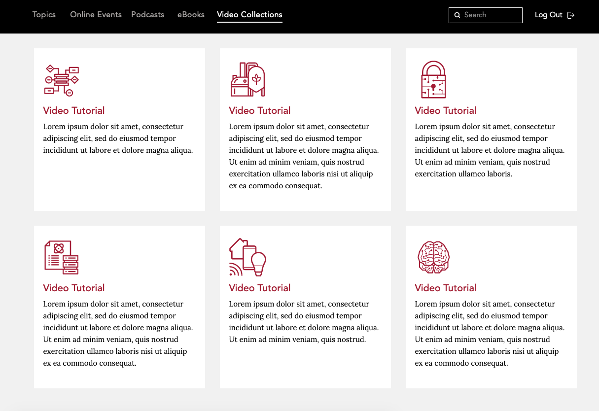
I had a request from a client to add a simple page on an existing website. The design was pretty simple, a group of div’s (which I will call cards) representing video tutorials.
The request seemed easy enough. At first I thought I’d just flex the cards. But after looking a bit closer at the layout I had the feeling that I've seen this before... and I knew that things were about to get tricky.
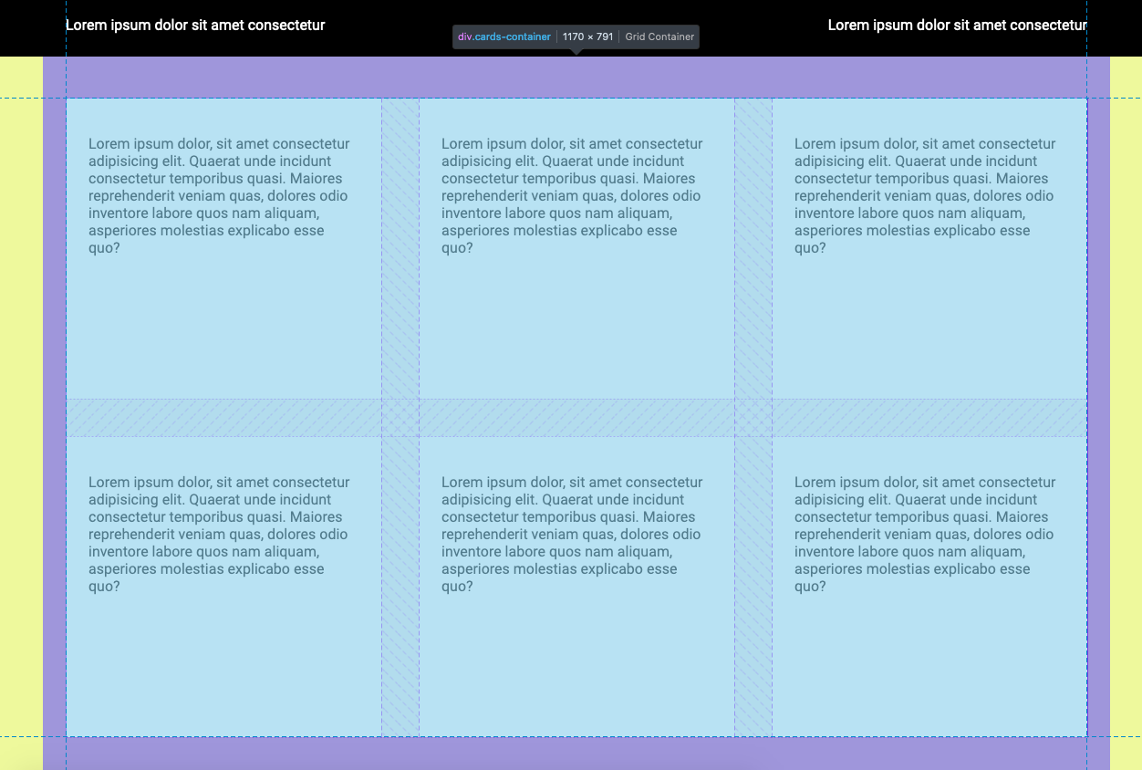
In order to walk you through the problem I’ve created a similar layout. Inside the cards container, six cards are divided into two rows and there can be three cards per row. As in the initial layout the cards have fixed width and height.
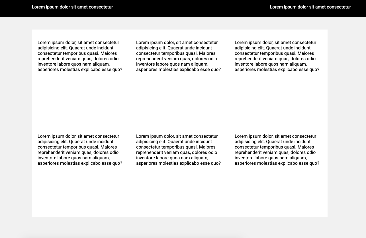
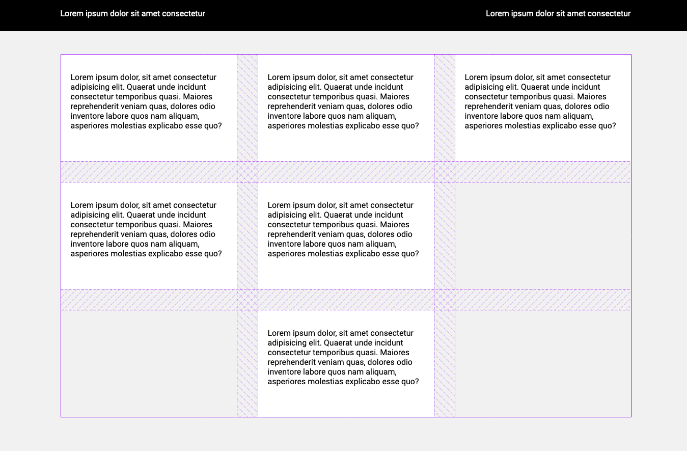
Not bad, but our cards need spacing. Some quick calculations tell us that the space between cards should be 41px. Let’s go ahead and add 41px right and bottom margins to the card.
But—oh no!—now we see that we have only two cards per row! What happened? Well, the third and sixth cards break into new rows because of that right margin we’ve just added. To fix the problem, only the first and second cards should have the right margin.
How can we adjust this in our code? Well, if we know the max number of cards then we use :nth-child selector and remove the right margin. The bad news, however, is that because we usually fetch data from the API, we don't actually know the max number of items.
Never fear! The good news is that when working on this problem I found out that there is a fairly new flexbox property called flexbox gap. At the time, it wasn't that well supported and it still isn't on Safari. Gap would solve our problem, but we still have some better options to explore.
There are other flexbox hacks that I won't go into, but the big takeaway is that there isn't a straightforward solution (at least that I know of) that is well supported.
The solution(s)
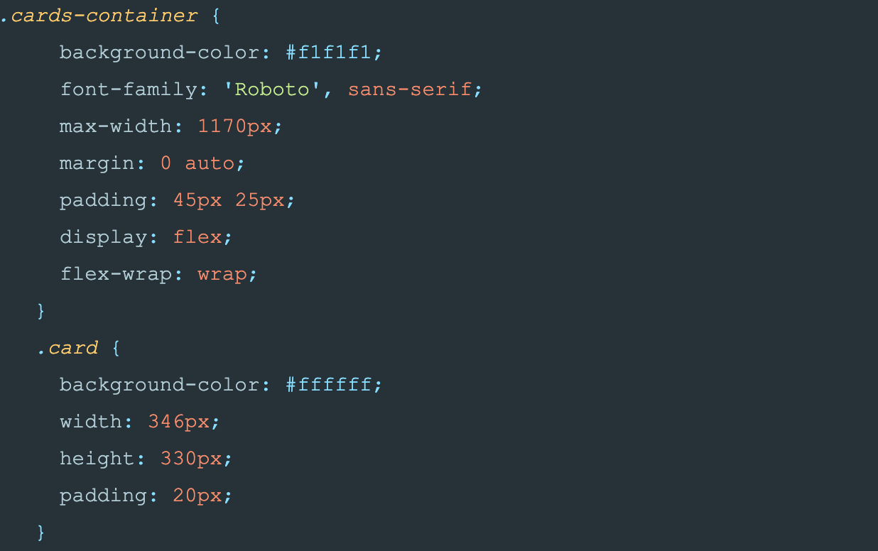
In order to take full advantage of the grid let's modify our CSS.
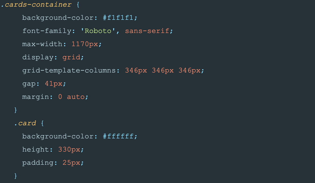
Here we see the grid-template-columns property. This property is what defines our columns.
Our layout has three 346px columns. The flexbox gap property I mentioned solves the problem that we had with margins. But a better, more elegant way of solving our problem is to define grid columns by using a repeat function.
Repeat function takes two parameters, number of columns or rows to repeat and second parameter is what you want to repeat: “grid-template-columns: repeat(3, 346px);”. We can use media queries and change layout to have two columns for smaller desktop and tablet, and one column for mobile.
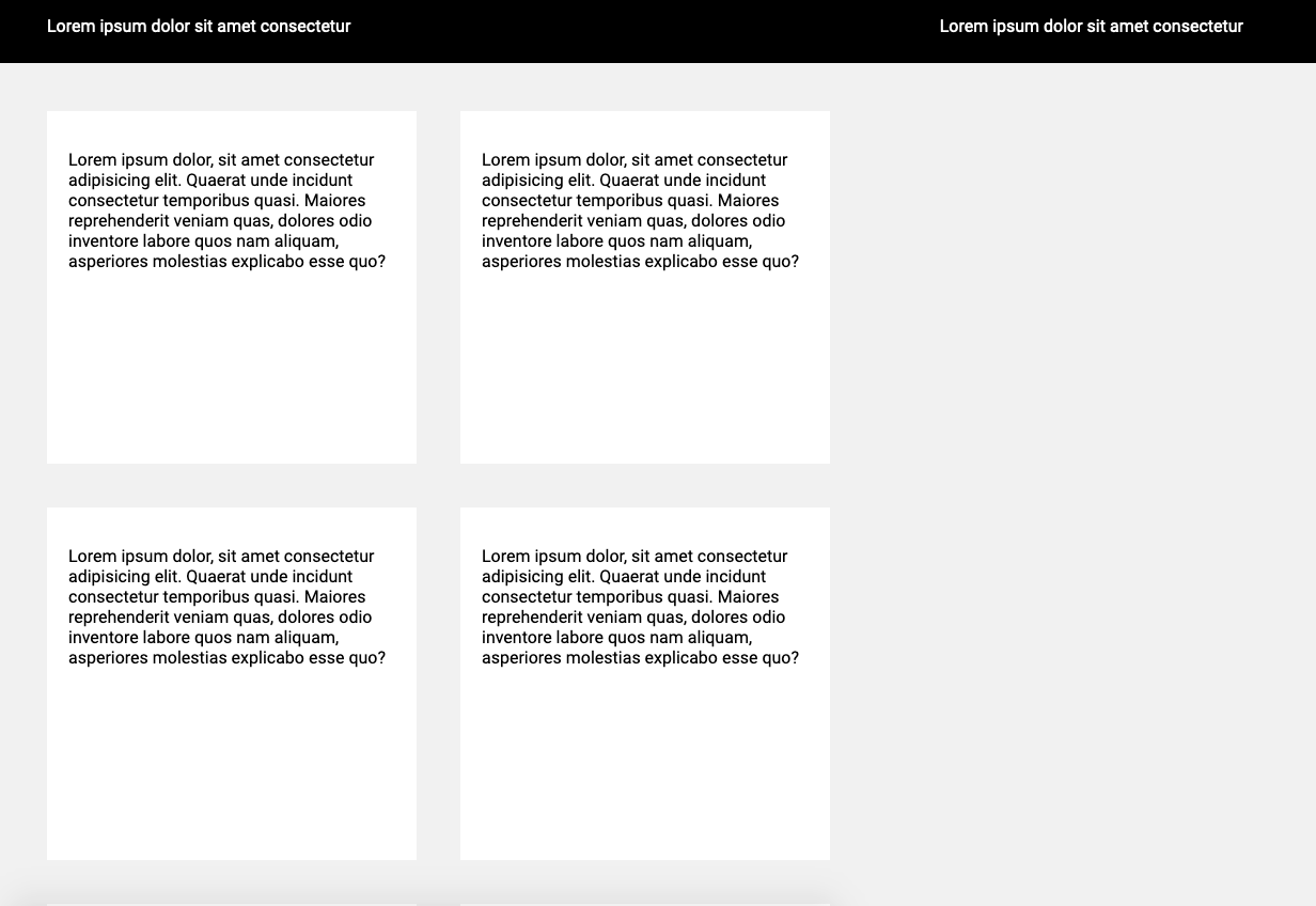
And that's it folks, we have a working layout that is clean and easy to understand!
But wait! There’s more...
What if we can get rid of media queries and have only one value for our grid columns?
Besides repeat function, we can use minmax function. It defines a size range ≥min and ≤max.
But before using minmax we must first explain another grid concept -- the fr unit. In the CSS grid, the fr unit (fraction) represents one part of the available space. The trick is that the browser calculates free space for us. If we change our repeat function to “repeat(auto-fill, minmax(330px, 1fr));” we get 3 columns without having to worry how much is grid gap.
In combination with the fr unit and minmax function we can use auto-fill keyword for the number of columns. With auto-fill you don't specify how many columns you want, you let the grid figure it out. Here’s an example of the code you need to use auto-fill.
In combination with columns and rows, grid allows you to place grid items into cells defined by grid. We can place the first grid item into the third row, second column.
In summary...
CSS Grid Layout is a powerful system which is worth learning. If you are still wondering why CSS grid, here are a few benefits as I see them:
- Cleaner CSS
- Gap between elements
- Complicated layouts are easier to handle, no need for hacks
- Ability to use fr unit
I hope this article helps you in your future CSS challenges.