Burndown charts are a popular aspect of the Sprint methodology and why wouldn’t it be: it’s a chart. Business people love charts! Ironically, the goal of this simple chart is to get all the stories done and reach 0 in time, and that flies in the face of everything it means to be agile and productive.
A Quick Recap
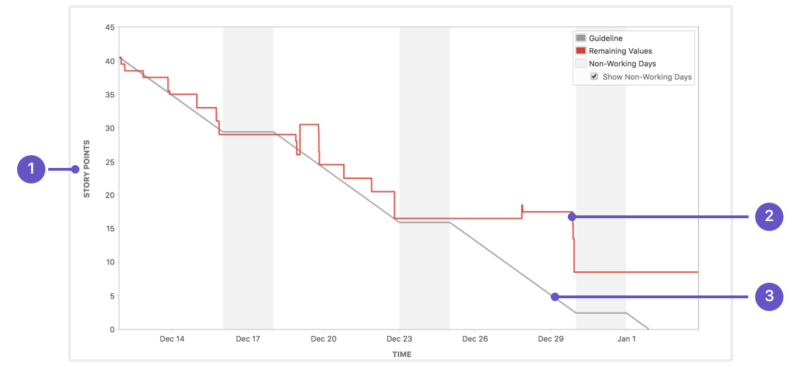
This is a burndown chart. The gray line is the “ideal” trending line for stories to be “burnt down” (i.e. make their way to complete/done). The red line is reality. It’s well-known that the ideal line is never really achieved. In this example, the team started with 40 points of work and ended with about 8 points remaining.
The Argument
The basic problem with a burndown chart is that its goal is to get to 0, which implies that everyone working on stories will finish their work at some point. But it doesn’t account for the next work item that needs to get done. Typically this means pulling in a story from the backlog. While that sounds simple, not all teams work that way since that kind of thing can make for one ugly burndown chart.
When stories get pulled into a sprint from the backlog, it causes spikes in the trend line. It also risks that this new, pulled-in story won’t be completed by the end of the sprint and thus the trend line will never reach zero. In some businesses, never reaching zero in a burndown chart is a bad sign. Even the chart itself implies this is a bad thing. This creates a strange atmosphere of “the perfect sprint” where everyone completes their work in a timely manner and all work is done just in time for the sprint to end. But the reality is that people will finish their work at different intervals, and just because a story is still open, doesn’t mean anyone can just work on it. Theoretically, if we lived strictly by the chart’s rules, we’d all stop working when we had nothing left to pick up, just waiting patiently for the sprint to end. No extra stories pulled in that can’t be finished in time: none of that funny business here!
Velocity Chart
Everyone loves a good chart with a trending line, but instead of focusing on a line to no-more-worksville, let’s focus on a line that highlights productivity. Keeping track of a team’s velocity should be a nice, steady line. But spikes/anomalies in this graph actually mean something significant. Just resist the urge to over-estimate when grooming stories just to see that line go up. The goal is to keep it steady.
Engineers, Not Robots
The shape of a team is one of the biggest reasons that a burndown rate will never be ideal. Let’s say we have a team that includes 3 engineers:
- Dade: there since the beginning (legacy knowledge)
- Andrea: came aboard two months ago (still learning, but confident)
- Seth: brand new to the team
In this common scenario, the person writing the stories will most likely not be the same person working on the story. Sometimes certain stories are best suited for certain engineers, which means the average team velocity is kind of hard to gauge. Dade’s velocity would be above average, Andrea’s velocity is probably close to average, and Seth’s average is close to 0. Dade’s going to have a busy sprint. There’s also a good chance that stories are light on details since a lot of the pieces in play are in the head of the person that wrote the story (dammit Dade!). Working on stories and not pulling them into a sprint will negatively affect this average velocity calculation. You should care a lot more about your velocity being accurate than an impossible-to-achieve line in a burndown chart.
Sprint Purgatory
Right near when the sprint ends and many of the last stories are making their way to completion, there’s a gap of working time for many engineers on the team. Once a story leaves the engineer’s workflow and goes to QA/staging/prod, their involvement with the story typically drops dramatically. If this happens at the end of the sprint, and the team has been encouraged to not pull in a story unless it can be completed in time, it’s uhh…. engineer party time?
There should always be allowance to pull stories into the sprint, because work being done should be visible and tracked. If the team is focusing on only pulling in stories that can be completed in the sprint, that means the backlog’s order is irrelevant. You’re then picking stories based on the convenience of their size, and then considering their priority. This also means that you’ll have an unexpected influx of work landing at the beginning of the next sprint that no one knew about.
Personally, I take this opportunity to tackle tech debt that the business doesn’t deem important, or update some docs to make everyone’s lives easier in the future (bad docs make sad engineers).
Let's Wrap This Up
Process is critical in just every organization, but blind acceptance of its rules can be dangerous. Kanban is flexible by nature, and focuses on a constant workflow, so that might be a better process fit. I will admit that the root of many sprint process related issues is how detailed the stories are. They need to be written with the mindset of “I’m giving this to a new team member”, but I digress: that’s a different blog post entirely.
Let’s face it, you could just show a fake burndown chart to whoever wants to see it, and no one is going to be able to tell the difference. 🤓